Google Redesign
Logo
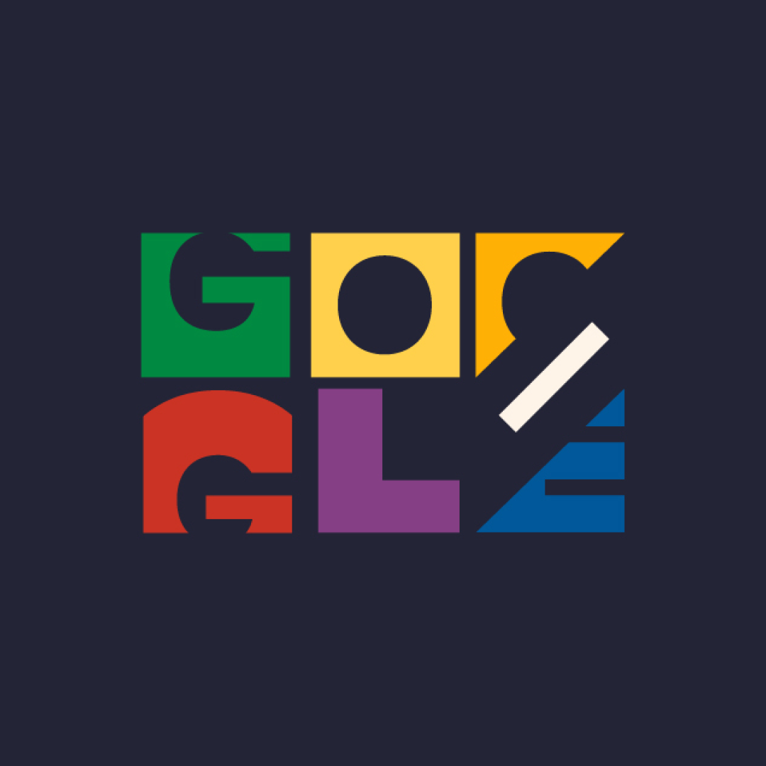
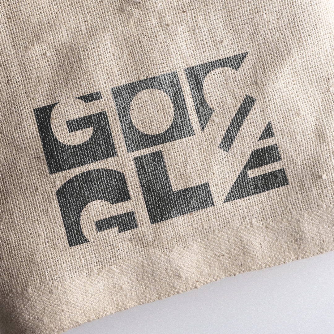
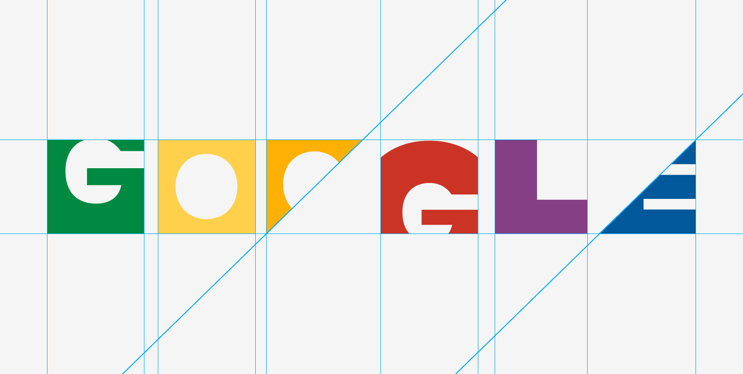
Google’s current friendly sans-serif has become ubiquitous, but it doesn't fully capture the immense complexity and structural role the company plays in our digital lives. The challenge was to reimagine the brand not just as an approachable tool, but as the fundamental infrastructure of the modern web
Team: Solo project
Role: Design
Type: Personal / Speculative
Year: 2025
A modular, geometric redesign inspired by Bauhaus principles. By reducing the letters to basic building blocks - circles, squares, and angles - stacked in a dynamic grid, the new mark visualizes Google as the essential, colorful engineering that holds the internet together